Components
All components support className and style props for styling. They include zero built-in CSS — you control the look entirely.
Every component supports a children render prop for full customization.
WishlistButton
Heart toggle button for wishlisting a product.
import { WishlistButton } from "@simplersuite/wishlist-react";
// Default rendering (heart SVG)<WishlistButton productId="123" />
// With callbacks<WishlistButton  productId="123"  variantId="456"  onAdd={(id) => console.log("Added", id)}  onRemove={(id) => console.log("Removed", id)}/>
// Render prop for full customization<WishlistButton productId="123">  {({ wishlisted, toggle }) => (    <button onClick={toggle}>      {wishlisted ? "Remove from wishlist" : "Add to wishlist"}    </button>  )}</WishlistButton>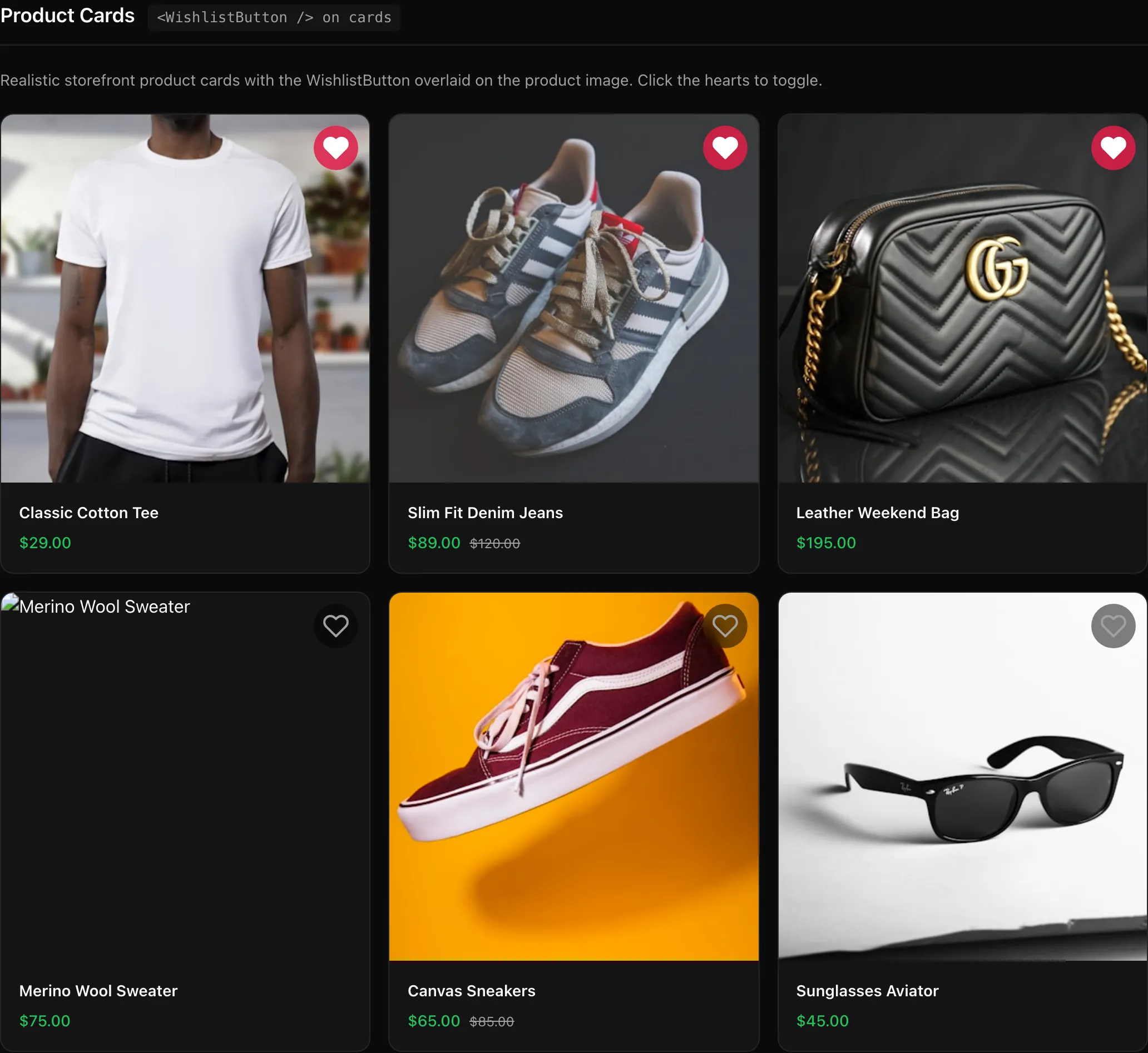
WishlistGrid
CSS Grid container for displaying wishlist items.
import { WishlistGrid } from "@simplersuite/wishlist-react";
<WishlistGrid  columns={3}  gap="1.5rem"  renderItem={(item) => <ProductCard key={item.productId} product={item} />}  emptyState={<p>Your wishlist is empty</p>}/>
// Render prop<WishlistGrid>  {({ items, loading }) => (    loading ? <Spinner /> : items.map(item => <Card key={item.productId} />)  )}</WishlistGrid>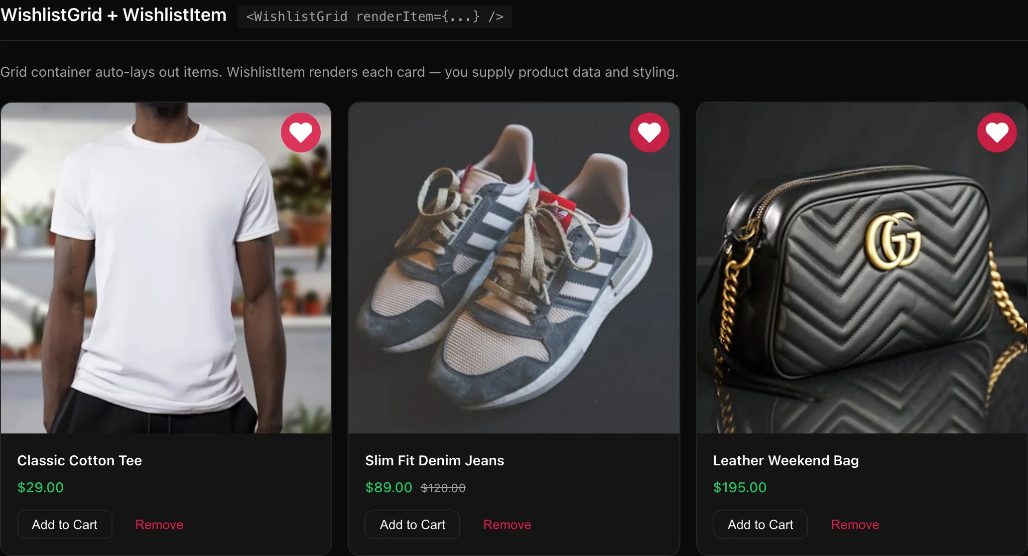
WishlistItem
Individual product card for a wishlist item. Accepts product data via the product prop — the SDK does not fetch product details from Shopify.
import { WishlistItem } from "@simplersuite/wishlist-react";
<WishlistItem  item={wishlistItem}  product={{ title: "T-Shirt", image: { url: "..." }, price: "$29" }}  onRemove={(id) => console.log("Removed", id)}  onAddToCart={(id, variantId) => addToCart(id, variantId)}/>
// Render prop<WishlistItem item={wishlistItem} product={product}>  {({ item, product, remove, addToCart }) => (    <div>      <img src={product?.image?.url} />      <h3>{product?.title}</h3>      <button onClick={remove}>Remove</button>      <button onClick={addToCart}>Add to Cart</button>    </div>  )}</WishlistItem>
WishlistCount
Displays the current wishlist count.
import { WishlistCount } from "@simplersuite/wishlist-react";
<Image src={demoCount} alt="WishlistCount showing default number and render prop with badge" />
```tsx// Default (renders a <span>)<WishlistCount />
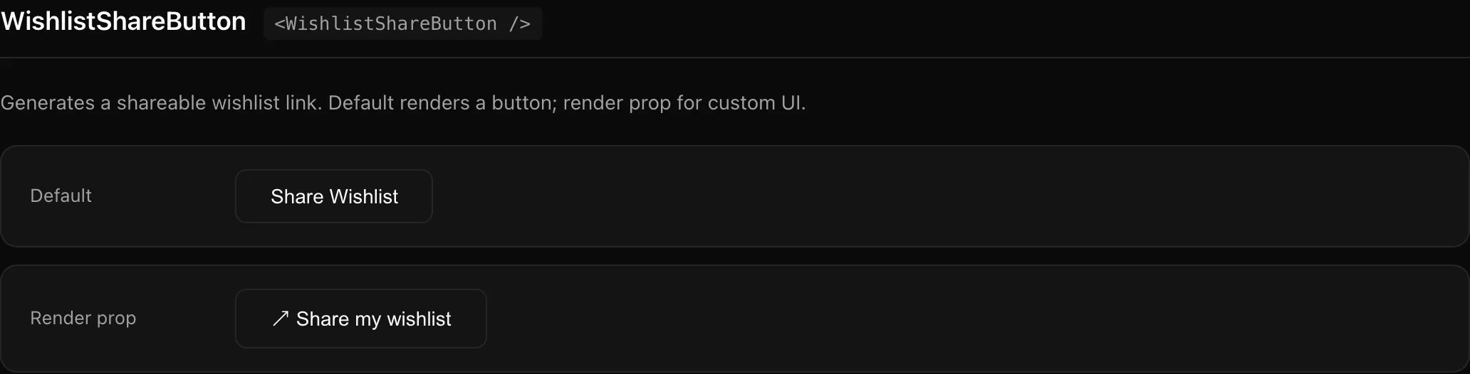
// Render prop<WishlistCount> {(count) => <Badge>{count} items</Badge>}</WishlistCount>WishlistShareButton
Button to generate and share a wishlist link.
import { WishlistShareButton } from "@simplersuite/wishlist-react";
<WishlistShareButton onShare={(url) => navigator.clipboard.writeText(url)} />
// Render prop<WishlistShareButton>  {({ share, shareUrl, loading }) => (    <button onClick={share} disabled={loading}>      {shareUrl ? "Copied!" : "Share"}    </button>  )}</WishlistShareButton>